
The video lesson for this topic is coming soon.
Essential Question
How can a graph show how two things are related?
Physics is all about finding patterns, and a graph is one of the best tools for spotting them. By the end of this lesson, you should be able to identify an experiment’s variables, build a data table and graph, find the slope of a trend line, write its equation, and use it to make predictions.
Variables
- Independent: what you change
- Dependent: what you measure
- Constants: what stays the same
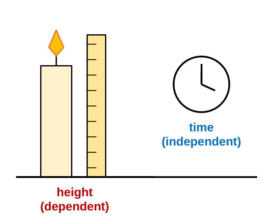
Imagine timing a candle as it burns and measuring its height. Time is the independent variable, the one you control or change on purpose. Height is the dependent variable, the one you measure because it depends on time. Everything else, like the type of candle and the air in the room, should be kept the same. Those are the constants, and they make the test fair.
Data Tables
- Independent variable: left column
- Dependent variable: right column
- Every heading has units
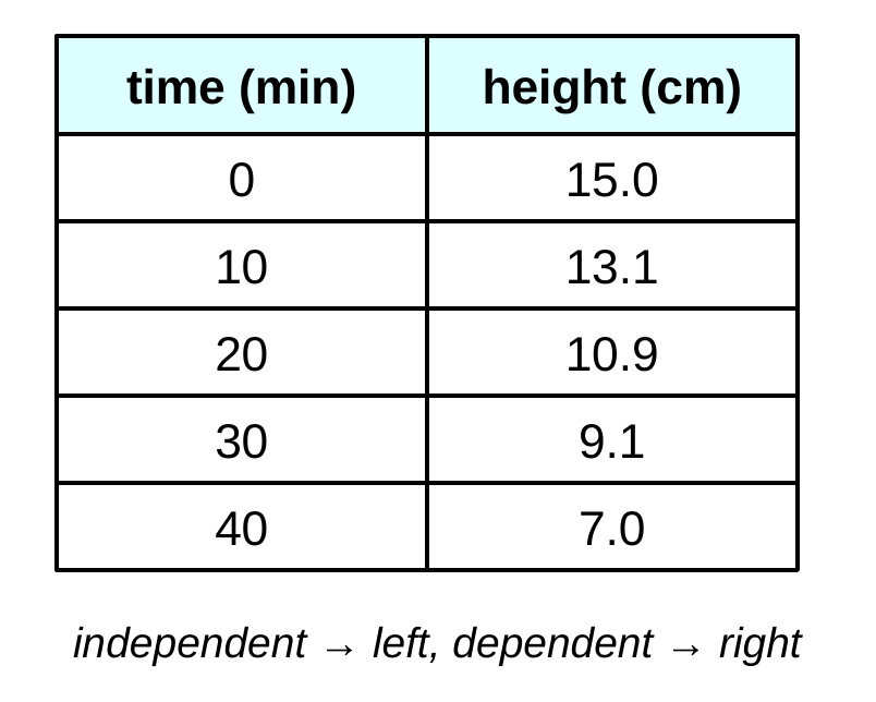
A good data table puts the independent variable in the left column and the dependent variable in the right column. Each heading names the quantity and its unit in parentheses, so the numbers below don’t need units written next to them. Keep the same number of decimal places for each measurement.
Scatter Plots
- Independent variable on the x-axis
- Dependent variable on the y-axis
- Title, labels, and units
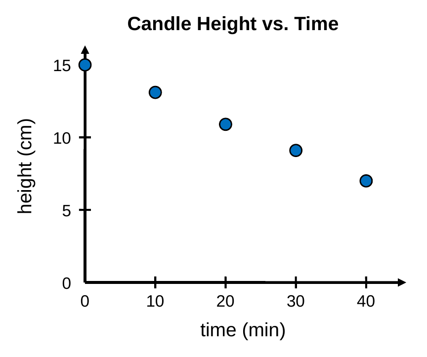
To graph the data, put the independent variable on the x-axis and the dependent variable on the y-axis. Label each axis with the quantity and its unit, choose an even scale that uses most of the space, and give the graph a title in the form “y vs. x,” like “Candle Height vs. Time.”
Trend Lines
- One straight line of best fit
- Points above and below it
- Never connect the dots
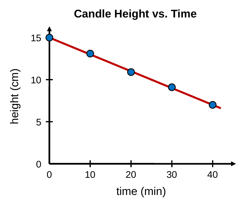
Real data always has a little scatter, so we don’t connect the dots. Instead, we draw one straight trend line (a line of best fit) that follows the overall pattern, with about as many points above it as below it. The line shows the relationship more clearly than any single point.
Slope
- How steep the line is
- m = rise ÷ run = Δy/Δx
- Units: y unit per x unit
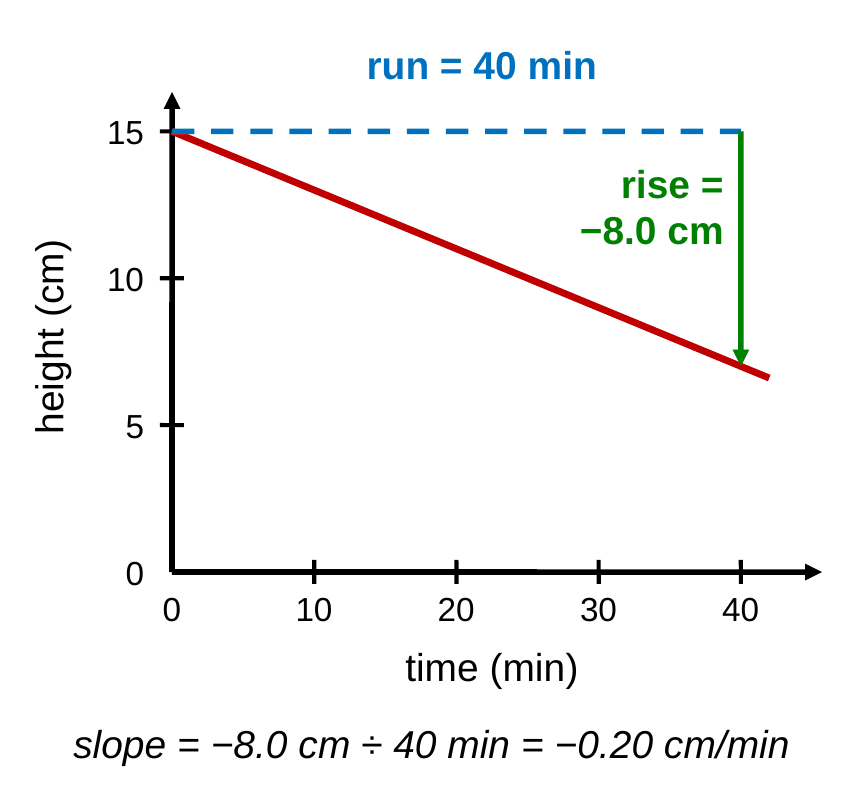
Slope measures how steep a line is: how much y changes for each unit that x changes. Pick two points on the trend line (not data points), find the rise (Δy) and the run (Δx), and divide. For the candle, the height drops 8.0 cm over 40 min, so the slope is −0.20 cm/min. The units of slope are the y unit divided by the x unit, and the slope has a real meaning: the candle shrinks 0.20 cm every minute.
Equation of a Line
y = mx + b
- m = slope (rise ÷ run), with units
- b = y-intercept, the value of y when x = 0, with units
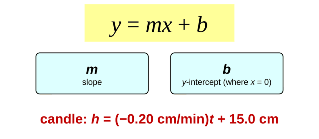
Every straight line can be written as y = mx + b. In science, replace x and y with the real variables and include units on m and b. The candle’s line starts at 15.0 cm and has a slope of −0.20 cm/min, so its equation is h = (−0.20 cm/min)t + 15.0 cm.
Extrapolating
- Extend the trend line
- Predict past your data
- Assumes the pattern continues
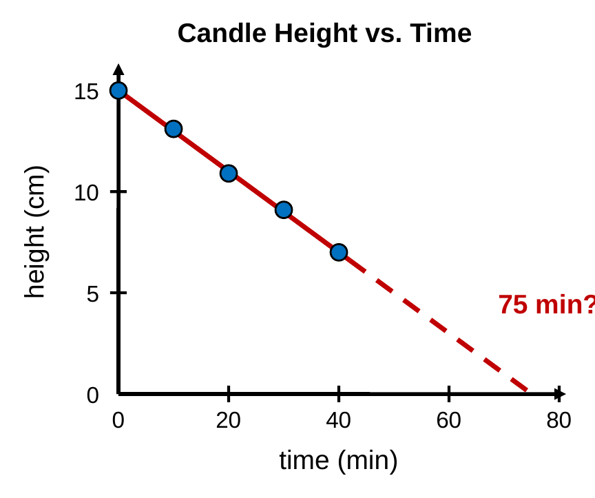
Extrapolating means extending the trend line past your data to make a prediction. Extending the candle’s line shows it would reach 0 cm at about 75 min, so the candle should burn out then. Extrapolation assumes the pattern keeps going, so predictions far beyond your data are less reliable.
Worked Examples
Try each problem on your own first, then check your work against the solution.
Example 1: Identifying Variables
Maya tests how a ramp’s height affects how far a toy car rolls. She uses the same car and the same floor every trial. Name the independent variable, the dependent variable, and two constants.
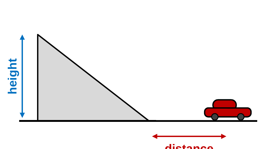
- Independent variable: what Maya changes on purpose: the ramp’s height
- Dependent variable: what she measures: how far the car rolls
- Constants: what she keeps the same: the same car and the same floor
A quick test: the independent variable causes the change, and the dependent variable is the result. “Distance depends on height” makes sense, so distance is dependent.
Example 2: Finding Slope
A trend line for water temperature vs. heating time passes through (1.0 min, 30.0 °C) and (4.0 min, 54.0 °C). Find the slope of the line.
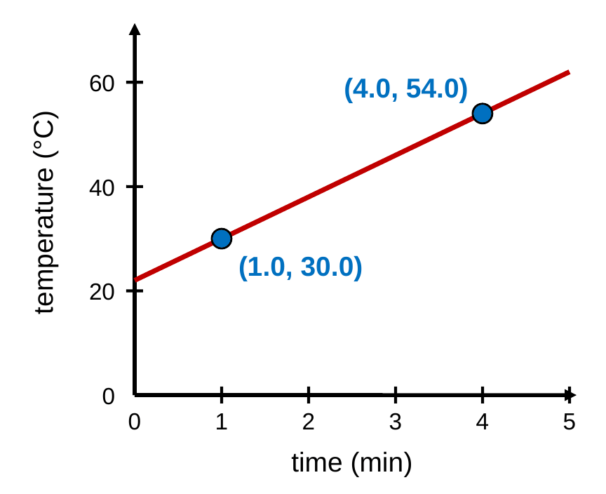
- Rise: Δy = 54.0 °C − 30.0 °C = 24.0 °C
- Run: Δx = 4.0 min − 1.0 min = 3.0 min
- Divide: m = Δy/Δx = 24.0 °C / 3.0 min
- Answer: m = 8.0 °C/min. The water warms up 8.0 °C every minute.
Example 3: Writing the Equation
A trend line for a plant’s height vs. time passes through (2.0 days, 5.0 cm) and (10.0 days, 9.0 cm). Write the equation of the line using the variables h and t.
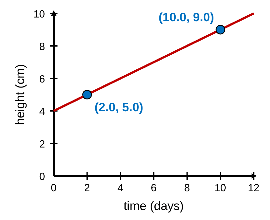
- Slope: m = (9.0 cm − 5.0 cm) / (10.0 days − 2.0 days) = 4.0 cm / 8.0 days = 0.50 cm/day
- Set up: h = mt + b, so 5.0 cm = (0.50 cm/day)(2.0 days) + b
- Solve for b: 5.0 cm = 1.0 cm + b, so b = 4.0 cm
- Answer: h = (0.50 cm/day)t + 4.0 cm
Check with the other point: (0.50 cm/day)(10.0 days) + 4.0 cm = 9.0 cm. It matches.
Example 4: Extrapolating
Use the plant’s equation, h = (0.50 cm/day)t + 4.0 cm, to predict its height on day 16.0.
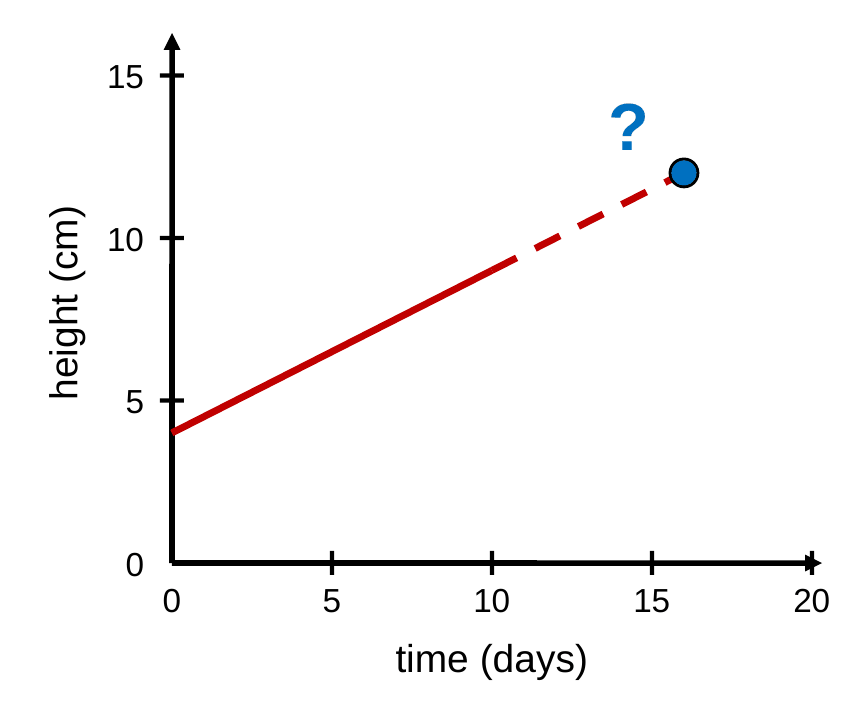
- Knowns: m = 0.50 cm/day, b = 4.0 cm, t = 16.0 days
- Substitute: h = (0.50 cm/day)(16.0 days) + 4.0 cm
- Multiply: (0.50 cm/day)(16.0 days) = 8.0 cm, since the days cancel
- Answer: h = 8.0 cm + 4.0 cm = 12.0 cm
Day 16.0 is beyond the data, so this is an extrapolation. It assumes the plant keeps growing at the same steady rate.
Big Ideas
- Independent → x-axis, dependent → y-axis
- Draw one straight trend line of best fit
- Slope = rise ÷ run, with units
- y = mx + b lets you predict
Back to the essential question: a graph puts the independent variable on the x-axis and the dependent variable on the y-axis, so you can see the pattern between them. A trend line’s slope tells you how much the dependent variable changes for each unit of the independent variable, and its equation lets you predict new values. Next up, we’ll start describing motion with distance and displacement.

